There’s no shortage of data points about the state of the U.S. economy (at least now that the federal government is up and running again). In fact, there are so many economic statistics — few of them pointing in precisely the same direction — that it can be hard to see the overall picture.
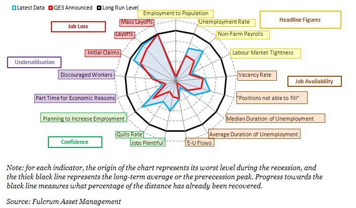
Which is why we like this spider-web chart from Financial Times blogger Gavyn Davies. It summarizes years’ worth of data on 17 key indicators in an easy-to-understand way — and with nary a number in sight. The center of the web represents each indicator’s low point during the Great Recession; the thick black circle represents either the long-term average or the pre-recession peak. The closer the colored lines move toward the black circle, the more progress the U.S. economy has made toward regaining the ground it lost.
The chart clearly shows that massive job losses, of the sort seen in 2008 and 2009, are mostly over, and that in most other respects the labor market has improved considerably, especially since the Federal Reserve began its third round of quantitative easing in September 2012. But two metrics, the employment-to-population ratio and the average duration of unemployment, have barely budged off their lows. (The Federal Reserve Bank of Atlanta produces a similar chart with interactive features that allow you to customize your view.)