Researchers and designers at Pew Research Center often create faceted information graphics, commonly known as “small multiples,” to communicate our findings. Edward Tufte, who popularized the term, wrote, “For a wide range of problems in data presentation, small multiples are the best design solution.”
Of course, small multiples aren’t a panacea, and they can’t always be applied to good effect. Small multiples shouldn’t be used simply to show more data, but to render it more sensible, too. Below, I’ll describe some of the things the Center’s staff considers when designing small multiples for publication.
Why use small multiples?
First, what are small multiples, and why do we use them? A small multiple isn’t itself a type of chart. Rather, it’s a method for displaying several charts, diagrams or pictures in a consistent manner, at a small size and in a grid layout. Consider this example:
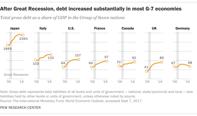
Legibility is one reason to use small multiples instead of a single, larger plot that contains the same information. At the Center, our reports rarely show more than five lines on a single time series chart because such a chart is usually hard to read. It can be difficult to distinguish and directly label more than a few overlapping lines in a single plot, and it often requires a color legend with several items. Imagine the seven lines in the graphic above on a single panel. Every line except for Japan’s would overlap with the others.
Instead, we follow the advice of Dona Wong’s The Wall Street Journal Guide to Information Graphics and plot each data series individually so that it can be seen and labeled more clearly. We want our readers to spend their time and attention absorbing our findings, not deciphering our chart legends. Small multiples can speed the interpretation of the graphic because there is no legend to decode.
Another reason to use small multiples for communicating findings is that it allows a designer to neatly arrange a large amount of information in a small space. That doesn’t just serve the purpose of tidiness (though tidiness is nice) — it allows us to present a more complete picture of our findings, with more context.
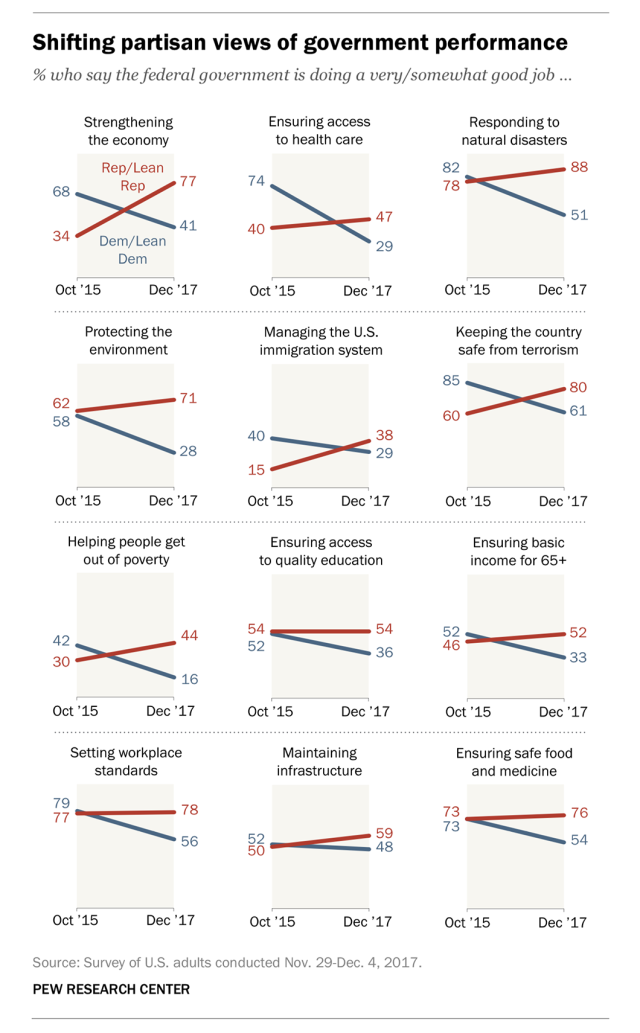
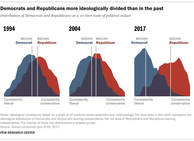
Consider this graphic. It shows readers partisan views on the federal government’s handling of a variety of different topics and issues over time. This approach allows readers to easily see a general pattern of Republican views becoming more positive and Democratic views becoming more negative. But it also provides perspective by showing that the extent of the shift varies by domain.
In other words, small multiples allow for comparisons. The more information in each panel, and the better organized it is, the more comparisons can be made. Each of us knows from experience that it’s easier to compare things that are right next to one another than it is to compare than things that are far apart. So it is with small multiples: They’re powerful tools for comparison because they put a lot of information side-by-side.
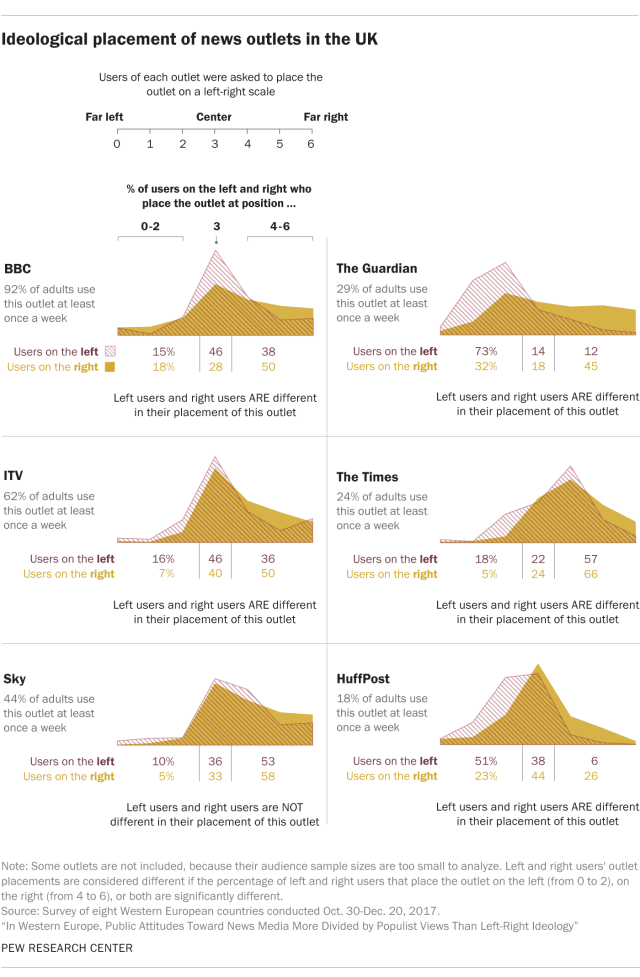
To further illustrate this point, here’s a graphic from a recent survey we conducted of people in Western Europe. Each of the eight panels shows six values, corresponding to the views of those who hold either mainstream or populist views on the political left, center and right. Together, 48 values can be compared within and across countries.

With so many comparisons possible, small multiples are as useful for analysis as they are for communication — if not more so. As Tufte wrote, “Small multiples, reveal, all at once, a scope of alternatives, a range of options.”
Some guidelines we follow when using small multiples
Researchers and analysts are comfortable being so immersed in comparisons. But a non-specialist audience might find small multiples to be overwhelming because they offer so much new information all at once. With that in mind, here are some things researchers and designers at the Center consider when using small multiples to communicate our findings:
Titles and labels: Our information graphics usually include a title that highlights a finding, with a subheadline describing what was measured or what survey question was asked. Small multiples contain many possible takeaways, and titles clarify for the reader which ones we’re most trying to communicate. Without titles to guide them, readers might still take away something from a particular display, but it might not be something accurate or meaningful.
Common style, scales and references: A common scale and visual style help readers make accurate comparisons across panels, so we typically use the same color, type style and axis ranges — in other words, a template. Ideally, the only thing that should change is the data.
Common reference lines can also help to make panels more easily comparable. In the example below, the designer included a gray line showing national public opinion on same-sex marriage to help contextualize the regional data being shown in each panel:
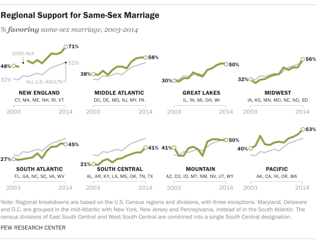
Panel order: Ordering the panels by some value is another way to help readers wade through small multiples. It’s not always essential; in the example above, for instance, the panels are not obviously ordered by some value.
But an ordered display can make findings more noticeable. For example, you could order the panels above from lowest to highest support for same-sex marriage in 2014, which would make it easy to identify the South Central and New England regions as the areas with the least and most support for same-sex marriage, respectively.
Ordering panels by some value often results in a repeating pattern that changes slightly from panel to panel, almost like an animation. In this way, panel order helps give the reader a narrative to follow — a beginning, middle and end. Indeed, time-based small multiples can be ordered left to right in sequence, as in this example:
Scale and pattern: The miniaturized nature of small multiples can sometimes mute differences between individual data points, making findings described in the title hard to see. Sometimes, small design tweaks can resolve this. Consider our earlier example graphic showing public opinion in eight Western European countries. A draft version used dots as data markers instead of horizontal strips, but that turned out not to be the best approach. Because of the compressed scale in each panel, the markers for populists and non-populist often overlapped, obscuring a meaningful gap between them. We restored the visibility of these gaps by converting the dot markers to horizontal strips. Shading the area between the markers also helped, making the patterns formed by the six values more visible as a whole. This in turn made it easier for a reader to identify similar patterns, or departures, in the other panels.
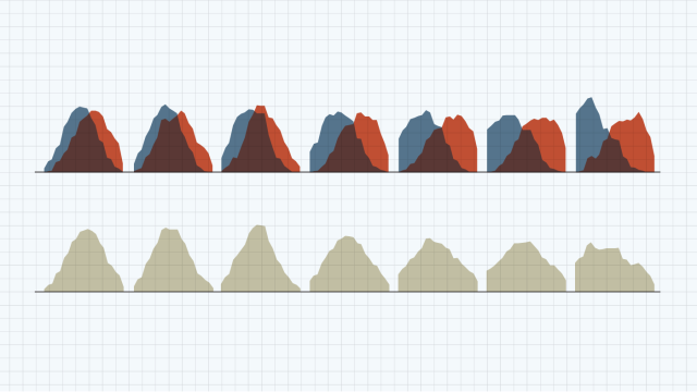
Annotation/explanation: In other cases, visual differences may be apparent, but their significance may be unclear. The graphic below shows where adults in the UK placed eight different news outlets on an ideological scale. The area charts show that audiences on the ideological right and left often place the same outlet differently, but those differences are sometimes subtle and not easy to judge or characterize. Because the graphic below shows news outlets with significant differences and those without, labeling each panel as such adds clarity.
Conclusion
This list of design considerations for small multiples isn’t exhaustive, and it’s important to note that every time researchers at Pew Research Center consider how to design a faceted display, we’re also deciding whether we should produce such a display in the first place.
Small multiples often require more time for a reader to fully absorb than single panel information graphics, and any information graphics that require close study are not the ideal format to use for audiences with very limited time or attention. But for those readers who do have time and attention, a carefully designed set of small multiples can communicate a lot of information.
Want to make your own small multiples? Excel is sufficient for making perhaps up to a dozen panels. Simply copy and paste another instance of the chart and then change the cell range that the new chart references, while making sure the scales, styles and sizes of the new instances remain the same as in the original. Excel’s alignment tools can be used to arrange the charts in a grid. For faster, iterative, or large scale work, the ggplot2 library for R can produce small multiples from a data set in seconds using the facet_wrap() and facet_grid() functions.


